Rule 1 - Creating a dashboard is an art

This is the top rule. It's the one and only rule. The other nine rules are subordinate to it.
What makes a painting a good work of art? What makes
you experience a painting or sculpture as beautiful and unique? I think great art causes a viewer to think or feel. It stirs something up. Good art needs more than its quality of execution. It needs to evoke something in the viewer's soul, mind or heart.
And so it is with your dashboards.
They should look professional (that's the quality of execution part)
, different, unique and, most of all, sophisticated (in the sense that they should strike a sympathetic chord with the audience).
Don't show people the same thing they've seen a hundred times before. They need to be impressed. And that, as it is very personal, is the most difficult part. The other nine rules however facilitate the process of achieving this.
Needless to say you shouldn't rely just on your own taste - remember that
there's no accounting for taste.
Rule 2 - Design your dashboard (and ask for feedback)
"Design means crafting communications to answer audience's needs in the most effective way"
There are, in my humble opinion, two schools of thought on how to accomplish this.
School 1: Here, you'll find
people who see designing an Excel dashboard layout as a multi-step process. They briefly sketch the initial idea, ask for feedback, make a first quick and dirty prototype, circle back to their stakeholders again with an outline of the dashboard, modify it again and so on. In other words,
they want to finalize the layout before starting to implement it. They believe that skipping this consultative process will result in the misery of having to rework the dashboard when the client's objectives are not met. There's nothing wrong with that approach.
School 2: I belong to the second school. Although the advice of the first school adepts seems reasonable, it's not what I do myself. Instead, I try to have the dashboard almost finalized before presenting it to stakeholders. Having followed the guidance depicted in the two previous articles, I know my stakeholders and I understand what KPIs or metrics are important. So,
I try to grab them by the throat with a first (and almost final) impressive design containing all the information they need. After all, I'm the specialist and that's what they pay me for, isn't it? This doesn't mean a stakeholder can't suggest changes that would add more value, but those will be limited. The audience often doesn't know all the possibilities Excel offers, so you cannot expect from them to shape the dashboard. That is your job.
Now, let's get into the more practical aspects of your dashboard layout.
Whether you feel more comfortable as a member of the first or second school of thought, and before anything else, reduce Excel's default standard column width as shown below:
Otherwise, on a standard A4 portrait layout, you will only manage to print 9 or 10 columns which doesn't provide a lot of options for nicely indenting tables, charts and data.
I like working with cells of 20 by 20 pixels as this allows enough flexibility to arrange all the dashboard elements. Certainly, you could still do this afterwards and I admit that when following my advice you might have to merge a lot of cells, but believe me, doing this upfront will save a lot of precious time later on.
Likely as not, you probably won't be able to consolidate everything your audience wants in a single dashboard. Reconcile yourself to that. There's no such thing as a one size fits all solution for dashboards. Instead, be clear on what purposes the dashboard needs to serve, and identify how many dashboards you'll need. You might want to consider using dynamics dashboards. Dynamic dashboards adapt themselves based on a selection made by the dashboard user. That way, several people can use the same dashboard but have it customized according their own personal needs. If you want to familiarize yourself with this, follow this link:
Cintellis University - Dynamic Charts.
Rule 3 - Fully control your dashboard and make it future-proof
Divide up your Excel workbook wisely and never let any (external) element interact directly with your dashboard, its layout or content. For example, never use a pivot table as such in your dashboard, where you won't have enough flexibility to shape it and rework it the way you would like to. Instead, store the pivot table in a separate worksheet and refer to its data in your dashboard.

So,
separate the raw collected data from the data shown in the dashboard and never import data directly into the dashboard itself but store imported data in separate sheets. Give your data sheets meaningful names like "DB extract customer table" or "Project cost update" so that you quickly know what data is stored where.
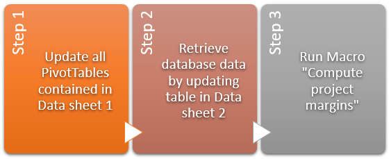
Also, think about how to update the dashboard and how often it will need to be updated. The more frequently your dashboard needs to be updated, the more you'll need an automatic process for updating the underlying data. Consider as well adding some SmartArt elements as a kind of user manual so as to remember what needs to be done and in what sequence in order to update the dashboard.
If you're going to distribute your dashboard in Excel format,
don't assume that the recipient has the same version of Microsoft Office as you do. Microsoft constantly upgrades and adds new functionalities to its products and it is conceivable that a function you've used is not available in some earlier versions. The same rule applies to using macros. Are you sure those who will use your reports can actually run macros and that it isn't prohibited by some company IT security policy?

Needless to say
the language Office is using as well plays a significant role in your formulas or formatting. Suppose that one of your PivotTables returns (blank) as one of its values. In your dashboard, you check on cell value = "(blank)" and decide, for instance, to replace it with an empty string. If one of your colleagues then uses a French version where "(blank)" is replaced by "(vide)" and another colleague uses a Dutch version displaying "(leeg)", that will screw up the results of your formulas for them. You need to consider if these are issues you'll need to address.
Rule 4 - Choose your colors wisely
Color is important. The colors, together with the overall design, will determine if your dashboard will be adopted - or not.
 There should be some coherence between the different sections of your Excel document.
 Stick to a certain set of colors that somehow go well together (creating a dashboard is an art, remember?) and use them for all dashboard elements: backgrounds, charts, tables, titles, etc. The exam question is how to select the perfect set of colors, as your own preferences probably won't be the same as those of the dashboard's audience. I follow some general guidelines for choosing colors myself:
- Using the company's colors is always a good way to start. If the company's logo is blue, green and yellow, then these are the colors you should include in the dashboard. This works extremely well at management level as they will recognize their company in the report you present. You could even combine the company's logo with the background of some chart elements for instance.
- Try to find something that unites the people you're making the dashboard for. It could be a football team, a sports club, national feelings, the colors of the environment they work in or something else. Use those colors in your dashboard.
- If none of the above works, use your own preferences. You'll always design something better when you like it yourself.
Whatever you decide on, stick to the plan. If you go for flashy colors, go all the way. If you go for soft tones, keep everything soft.
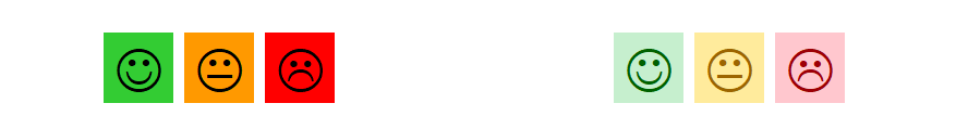
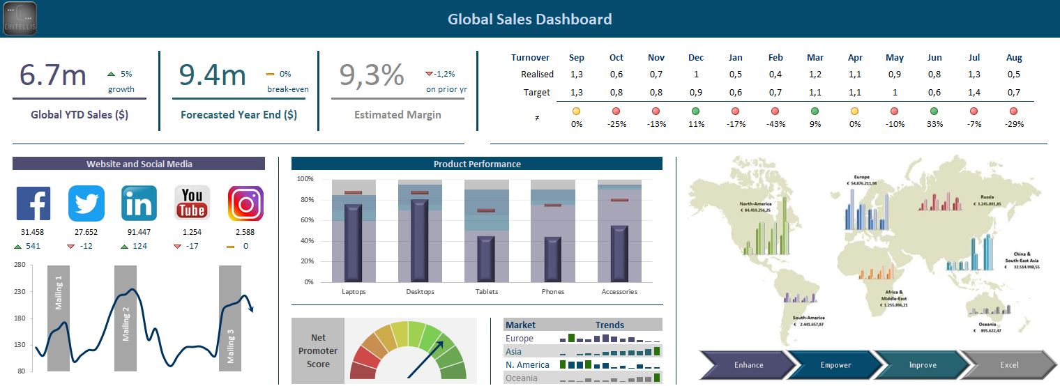
People should have a feeling of consistency when looking at your reports. Try combining different background colors with different text colors. Play with transparency or let Excel inspire you with its built-in color schemes. Have a quick look at the examples below to inspire you:
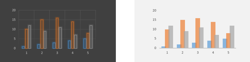
- Do you prefer the flashy smileys on the left or the soft ones on the right? Of course, it depends on the overall design, but I find the right ones far more appealing. The combination of the light background color with the same darker front color creates a less jarring effect.
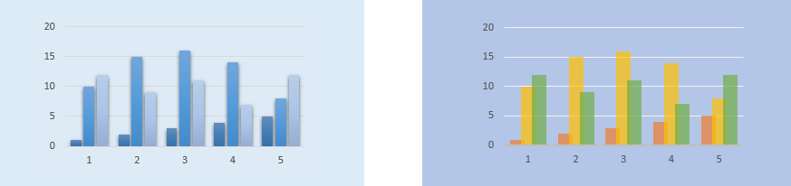
- Would you go for a dark background with neon-style bar charts or for a semitransparent version? The background color should be set for the whole of your dashboard. Don't mix dark and light backgrounds in the same document (coherence, remember?). Personally, I like the dark grey background but only if the dashboard isn't going to be printed - unless you like spending money on ink cartridges.
- Do you prefer monochromatic or colorful designs? Monochromatic looks classy, but will it sufficiently highlight the differences between the data series? It's up to you to decide.
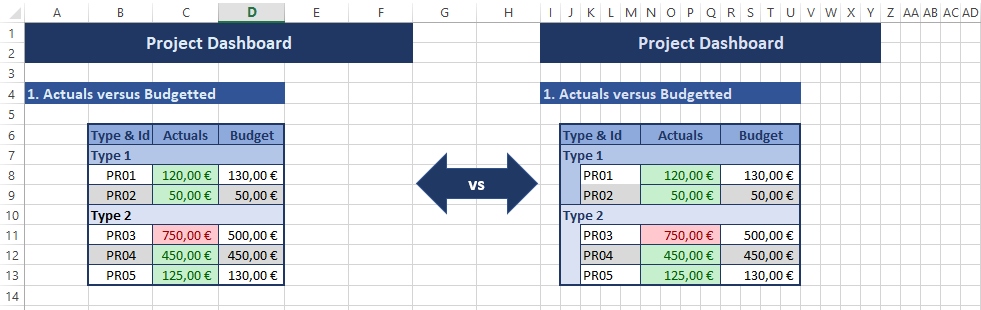
Colors can also be used to highlight data and draw attention to it. For example, if you have sales data, you could highlight the year with lowest sales value in red.
Rule 5 - Don't let fanciness destroy the message
Of course, you want your dashboard to be appealing. Just don't make it too fancy. There's nothing wrong with being aesthetically pleasing, with decorating your dashboard or using nice ornaments, so long as it matches the context. I've seen people designing dashboards using almost every option available in Excel: 3D charts, shadows, WordArt, glowing features, soft edges, only sophisticated charts etc. You never need all of them to make your visuals, charts and tables look great. Instead
aim for decorative minimalism, that is,
just enough visual interest to adequately support the message.
Don't forget that your dashboard is telling a story. Your audience shouldn't be distracted from that.
Rule 6 - Select the right charts
Excel gives you a lot of charting options and you need to
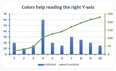
master the technique of selecting the right chart for the right purpose. For example, if you have to show a trend, you need to use a line chart, but if you want to highlight actual values, a bar or column chart could be the right choice. I as well highly recommend using combination charts allowing users to compare values and draw meaningful insights. For example, you could show the sales figures as a column chart overlaid with growth as a line chart. Working with a second Y-axis can work too, but pay attention, because it can be confusing to understand what chart element refers to which axis. Colors can help to make that clearer.
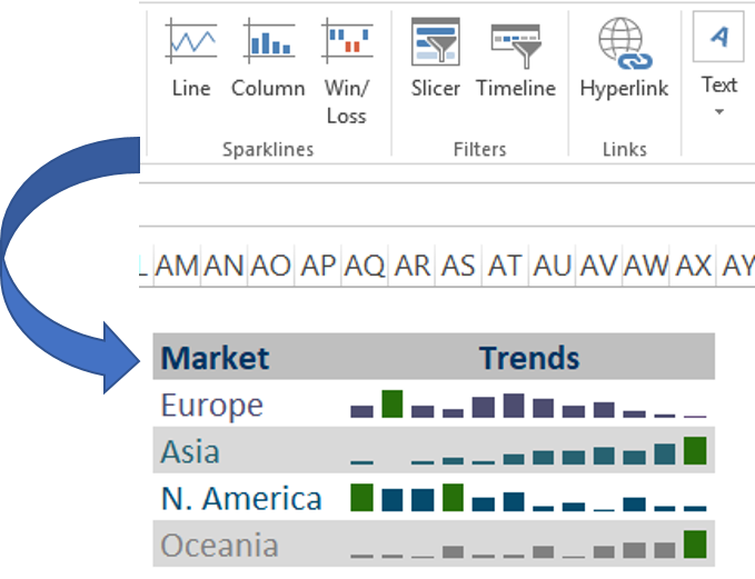
Have you heard of sparklines? As part of Excel 2010, Microsoft introduced an exciting new charting feature called "sparklines". You can refer to those to make your data more meaningful:
a sparkline is a tiny chart that resides in a cell. These are useful when, for instance, you want to show a trend over time but need to save space on your dashboard. This brings me to another interesting thought when designing your dashboard: are you going to need to keep track of the history of some KPI's, or will you just need the current value? That, of course, will be related to rule 3.
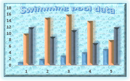
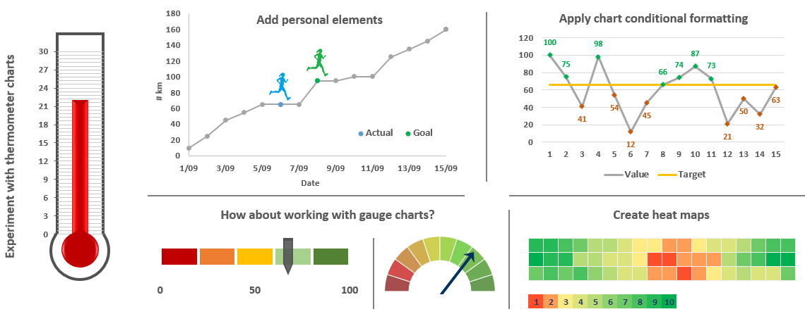
Last, but not least, there's a vicious tendency nowadays of using
non-standard charts. Needless to say I'm a fan of those (grinning). Have a look at the examples below. Why not pimp your dashboards with your own creations? For sure, you'll need to practice before being able to reproduce them, but it isn't rocket science. As always, don't overdo it: when the graph is hard to read or appears to have been tweaked too much, it stops being believable.
Just make sure the type of chart and its level of sophistication correlates with the story it needs to tell.
 Rule 7 - Don't fill every white space

Don't clutter your dashboards. Just because you have the data and charts doesn't mean it should all go into your reports. Stick to the KPIs you have identified that will help to implement your strategy, identify problems or aid in making decisions. Keep dashboards relevant and remove anything that doesn't belong there.
Concentrate on the must-haves and only add nice-to-haves if there's a lot of empty space left. In the unlikely event that you're running out of space, play with some tricks, like the examples given in rule 6, and use combination charts to save worksheet space. If it still doesn't work, create a second dashboard.
This rule also applies to the other "non-dashboard" sections of your Excel document. If, for instance, you need just one column of a database table for your data analysis, don't just download the full table into your Excel document in a misguided attempt at simplicity. It will slow down the workbook, use unnecessary space and make it difficult to share. Concentrate on that single column and get rid of all irrelevant information. If you're familiar with SQL, you might even write your query to retrieve only the information you need, instead of doing the job in Excel.

Also, make sure to
clearly separate every section in your dashboard using lines, cell backgrounds, images, etc.
Rule 8 - Master conditional formatting
Even if we have carefully followed rule 7, dashboards can still be overwhelming with lots of details and context.
A simple way to direct a user's attention to the important stuff in a report is to use conditional formatting. Excel provides plenty of built-in options and all you need to worry about is choosing the right one.
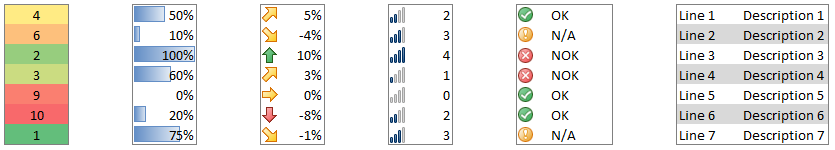
Too many alerts of course can be distracting, so you'll have to find the appropriate balance, adding just the right amount of this extra layer of analysis to your dashboard.
Conditional formatting can also be used for many other purposes. For instance, I use it to improve readability by highlighting every other row (banding). Of course, the built-in table feature does offer several predefined formats that include bands, but tables might not be exactly what you're looking for (well, although I'm a huge fan of Excel tables, I don't like using them directly in my dashboards. Rule 3, remember?).
Rule 9 - Learn some extra tricks
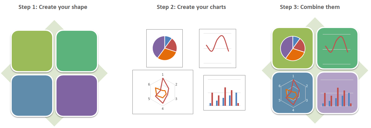
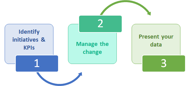
This is where you rely on your own creativity... Think of something that would look nice on your dashboard without worrying about its technical feasibility. In most cases,
Excel will be able to meet your expectations, so just give free reign to your imagination. Below is an example where, instead of merely putting some charts next to each other in a report, they were combined into a SmartArt shape, adding an acceptable level of frivolity to the purpose.
Just a few more thoughts:
I also like to
number the different sections of the dashboard just to guide the reader's eye, even if there isn't any particular order to follow. It provides some clarity and gives the peruser a sense of control.
Consider how your dashboard is going to be distributed. Will it be in hard copy or soft copy? In case of the latter, you might need to restrict movement in the dashboard area by hiding rows or columns to make sure the user doesn't accidentally scroll away. You can also freeze important rows or columns that you always want to be visible on the dashboard. And don't forget to set the printing area appropriately.
Rule 10 - Practice, practice and practice again
"ex nihilo nihil fit - nothing comes from nothing"
You will gain nothing if you invest nothing. Devote some time looking for online resources, reading inspiring articles, trying to design dashboards yourself, falling but getting up again with a better version, etc.
Remember the 10 rules in this article - if you break too many of them, it'll backfire somehow.

The good news is that you're not alone. The online community is very lively and you'll find tons of inspirations and ideas out there.
The other good news is that
Cintellis can help you with all of the above. We even provide some free advice and assistance on Excel, in general, and on dashboards, in particular. We offer solutions in Belgium, our home country, but provide remote services to customers located all over the world. Don't hesitate to let us know if we can be of any help there with the right reports, you have the foundation to gain valuable insights and make better business decisions.
From professional report authors to top management to staff in the field, Cintellis can meet the reporting needs of your organization. I hope you enjoyed this article and I'm looking forward to hearing from you soon.


 Don't think too much about which tool you'll need to use to create your reports. That's been answered already - Excel. Therefore, I'll be sharing my Microsoft Office experience for creating appealing, eye-catching and really useful Excel dashboards.